BIOVIC
Logo, Web design & development
/ABOUT
ABOUT THE COMPANY
BioVic is a young brand that aims to expand the limits of organic food consumption in Moldova. It offers quail meat and eggs, as well as solutions for raising quails.
Through organic food, the way of caring for the birds and the arrangement of the farm at the level of exigency imposed by the European standards, BioVic offers the guarantee of ecological products of a superior quality.
The stage of incorporating the brand in digital was an inevitable one, and we were entirely responsible for creating the logo and website, from the development of the design, to the writing of the texts.
BIOVIC
Logo
/IDENTICAL CREATION
LOGO – COMBINATIONS MARKS
The symbolic part of the logo directs the user to the direct involvement of the quail company. The font is made using a modern one – Sans Serif, which is easy to read. Because the manufacturer focuses on the naturalness of the product, the color scheme is made with green-beige tones. The logo includes the product sold by the brand, rendered by a symbolic shape: a quail, and not just any quail, but one with a leaf-shaped wing, in order to highlight the organic origin of the product.
To breathe the logo, it was decided to use shadows to make the symbolic quail part more voluminous.
BIOVIC
To breathe the logo, it was decided to use shadows to make the symbolic quail part more voluminous.
/WEB DESIGN & DEVELOPMENT
WEBSITE DEVELOPMENT
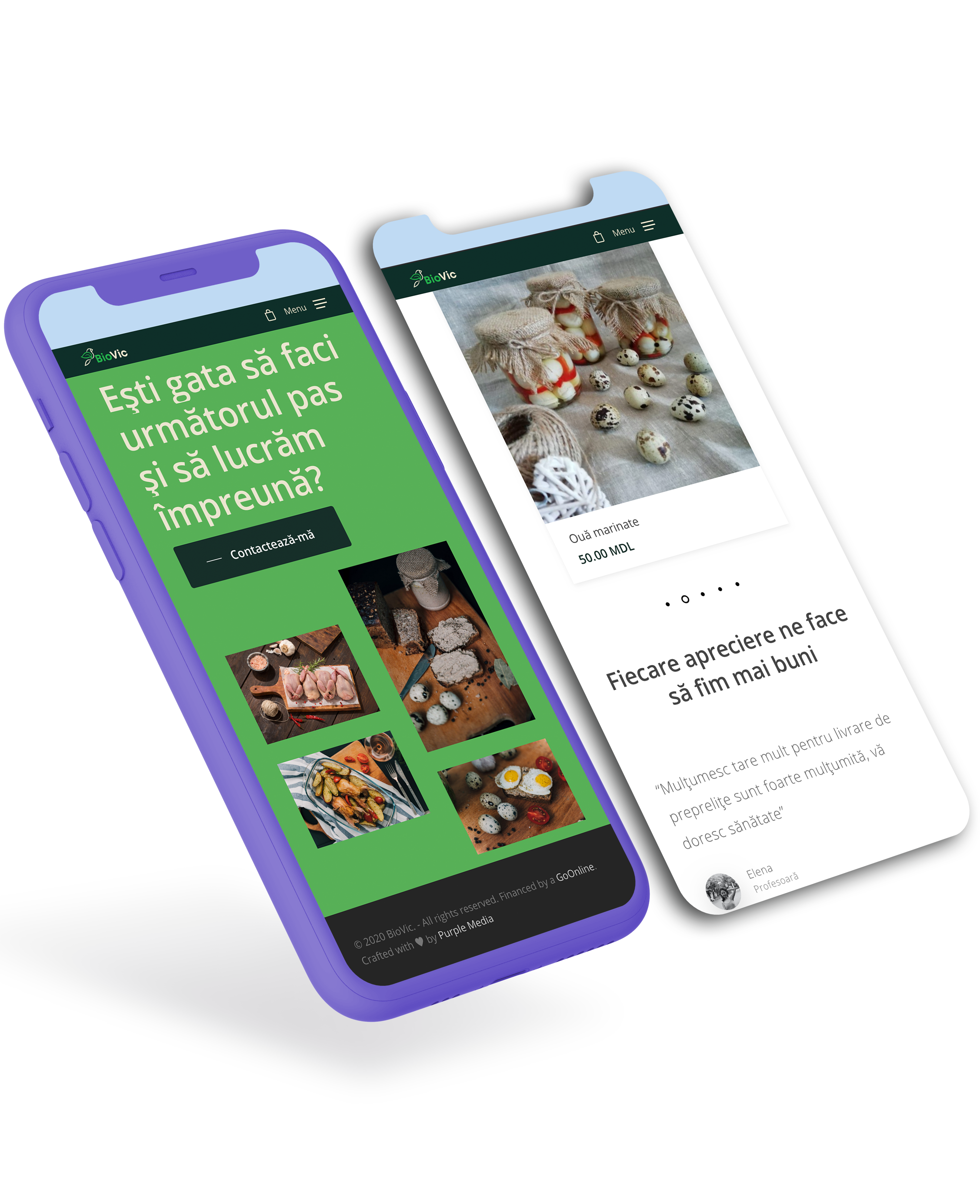
The choice of the structure trajectory in the development of the website was based on a single principle – accessibility. A minimalist style, an attractive interface and an easy-to-use menu were the landmarks in creating the site, as the emphasis was on a user-friendly and accessible user experience.
The menu includes the main page, the brand presentation page, the shop, the blog and the contact page. Also, the website not only fulfills the function of informing and knowing the brand, but also offers the user the possibility to place an order online.
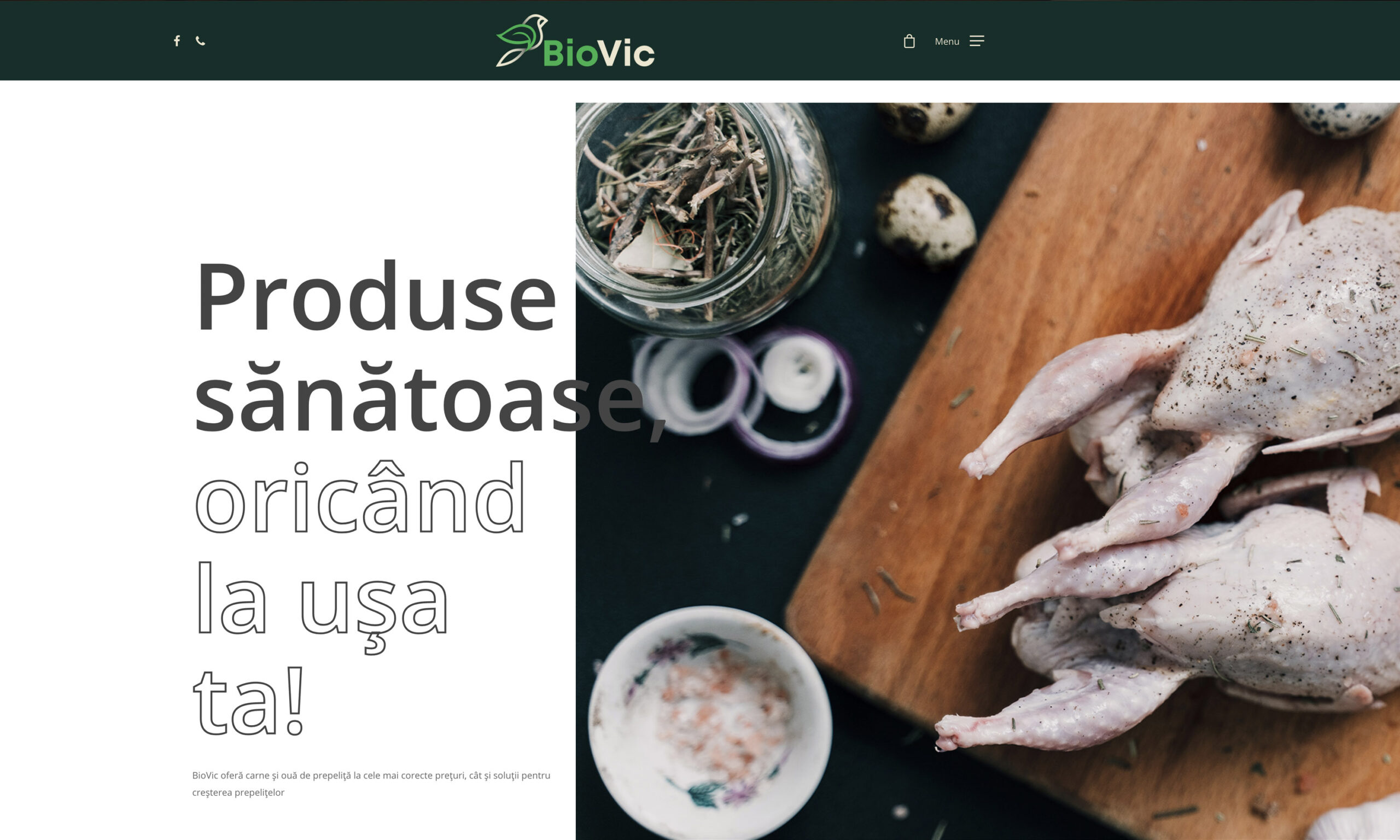
BioVic’s intention is to deliver the highest quality organic food directly from the manufacturer. This essential aspect was integrated in the visual identity of the brand, materialized by the selected colors and design elements that suggest the bio alternative.
Thus, the choice of green color in different shades is perfectly motivated, for the main color palette, symbolizing in the most obvious way the natural source of the products and their organic connotation. Another main color was white, due to the fact that we wanted a simple and minimalist approach to streamline the content of the web page. In the menu structures, beige was chosen, being a chromatic color, which can be identified in the logo. And to give dynamism to the web design, the imagery used included photos in warm colors such as yellow, red, orange and brown.
Regarding the text, a humanistic font has amplified the feature of the site’s accessibility. The Open Sans font is known for its excellent readability, both on large and small screens, which is a plus in web optimization for various devices.
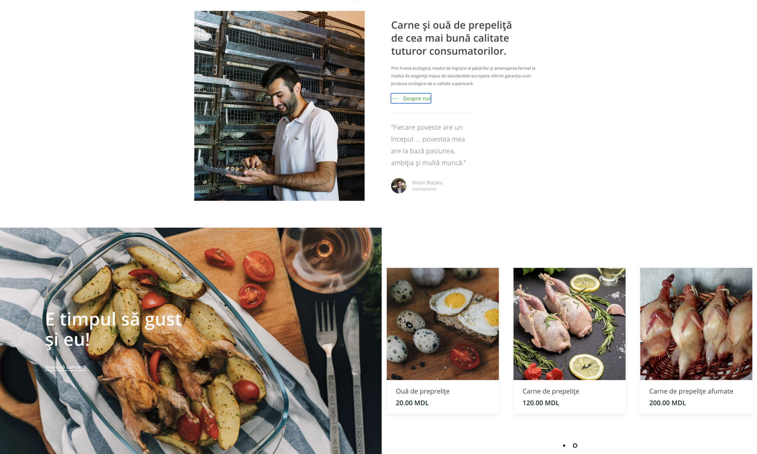
“Appetizing” photos
The concept of the photo session started from the desire to present the inclusion of the products sold by BioVic in our daily meals. It was chosen a relaxing approach, in which food is bathed in warm colors, to suggest the pleasant feeling of home and give a dose of dynamism to the images. The result was an appetizing one and framed in the visual identity of the brand.