


Even if images and videos can inspire customers in a choice, the construction of a tourism site must still have a design to everyone’s liking. In the design and construction of sites, in addition to text and content, a very important aspect to consider is the choice of colors.
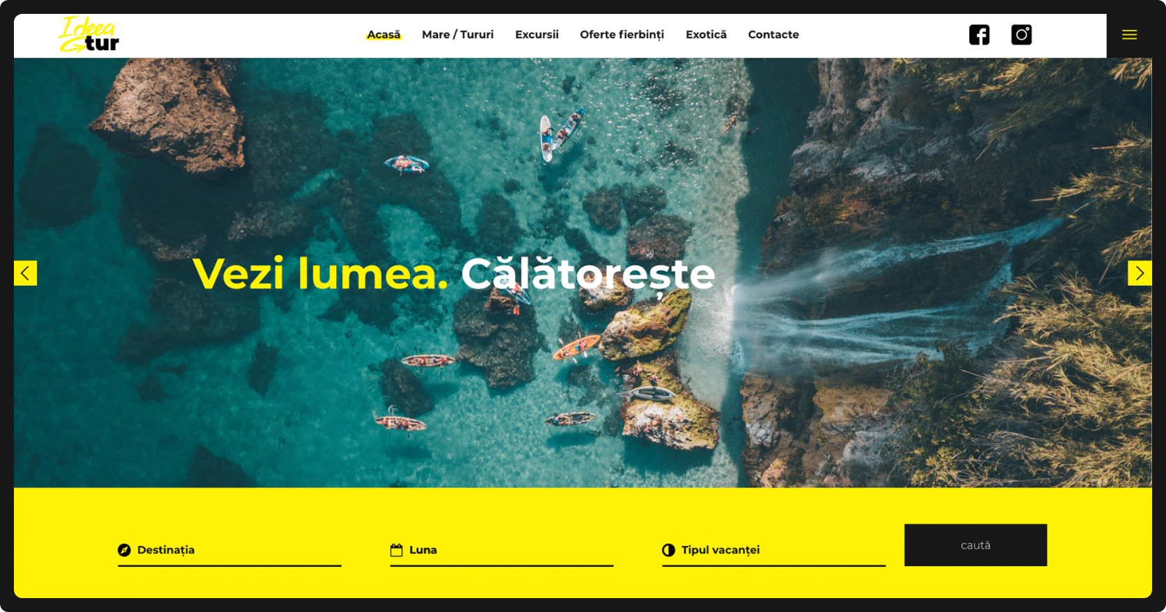
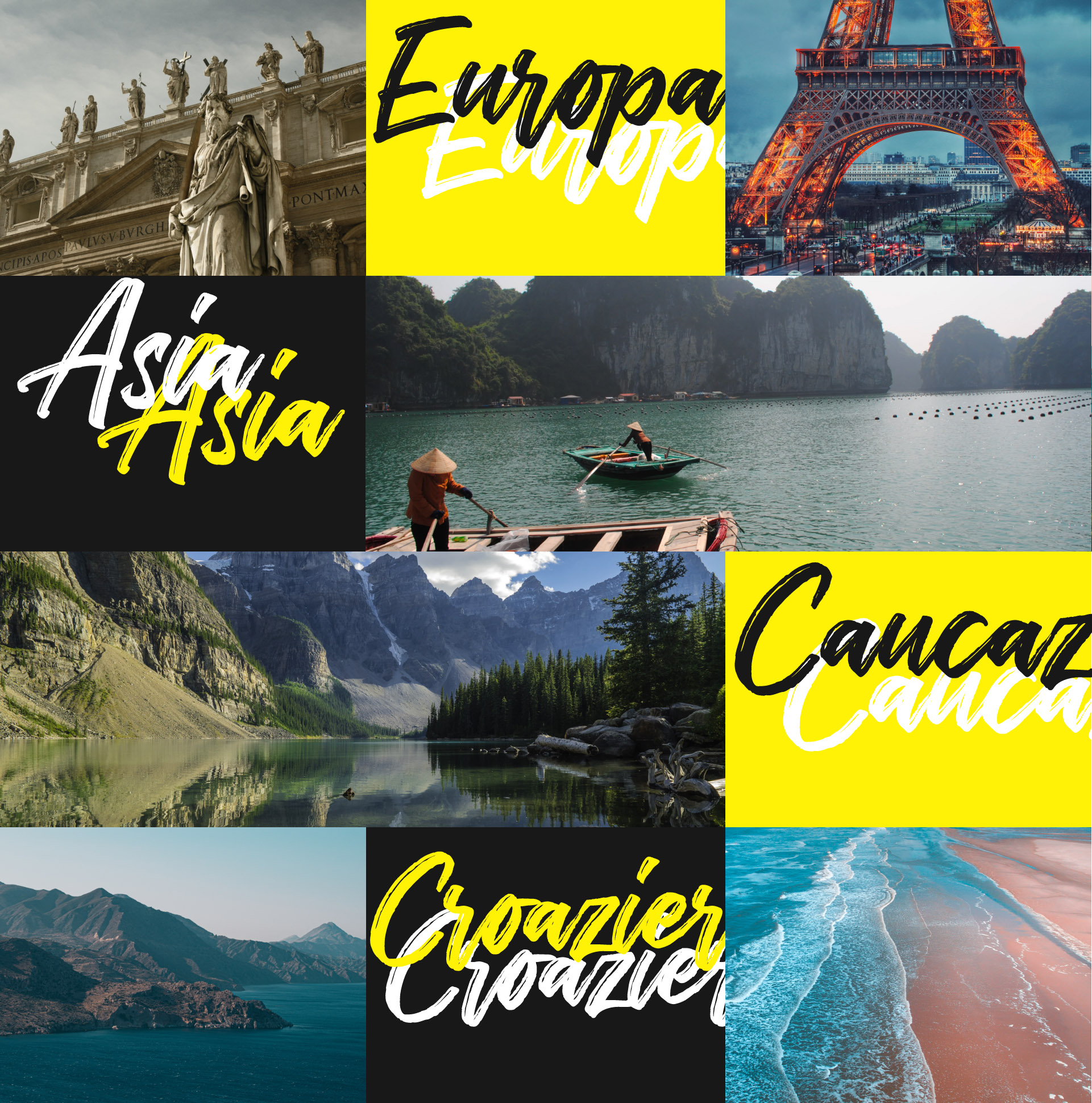
Color is the easiest and most advantageous way to convey the message to visitors. Starting from this idea, the first thing we drew attention to was the color. Our choice fell on yellow. Yellow is the most visible color of the spectrum, so the human eye distinguishes it from other colors. Yellow is the color of: happiness, warmth, impulse, adventure.
Every web designer knows and will confirm how important it is to choose the right font for your site. Therefore, choosing fonts is an important step in developing the company’s corporate identity.
Montserrat
Font family
The main text
Historia
Font family
Headlines
When creating the site for the travel agency Ideea Tur, there was used as a basic font Montserrat. It is a modern, universal font and has the task of giving clarity and impact to any communication.
It is very convenient to use due to its easy readability and a wide range of styles.
The second font, namely Historia, is best suited to the mood of the project and is used to emphasize certain phrases, words. Last but not least – to attract the user’s attention and to emphasize the spirit of adventure.
To provide a pleasant user experience, the site has been adapted for all types of devices.
Proiectele profunde încep cu completarea acestui formular
2021 © Purple Media S.R.L. New vision of digital culture